
HI, I’m Charles - an aspiring newsroom developer and data journalist, currently completing the MSc in Computational Journalism at Cardiff University. I’ve been learning data visualisation, information processing and digital journalism.
My curiosity for what is happening around my is only matched by my desire to share that information with others.
I’ve been interested in journalism from an early age – in the stories coming in from around the world. More recently I’ve started mastering new tools and ways of story telling as you can see from my portfolio.
Anyone can make the news interactive, but I believe it can also be more relevant and meaningful through developments in digital journalism and the ability to write your own news apps.
I’m very enthusiast to be entering the industry at a time of great change and look forward to exploring the limits of the possible futures of journalism.
I’m a proud Montréalais – meaning I’m fluent in French and English. And, if you were wondering, I can rustle up a mean poutine.
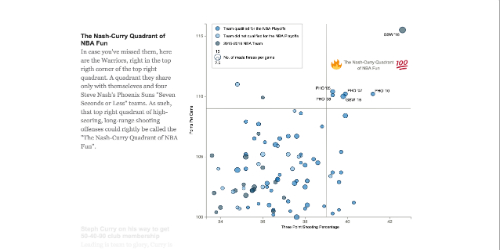
Interactive scroller highlighting the Golden State Warriors statistically amazing season. The scroller was built following Jim Vallandingham (@vlandham) scroller tutorial. It also makes use of Matthew Conlen (@mathisonian) D3moji.js. The data was last updated February 9, 2016.
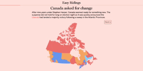
Interactive Story going through the Canadian elections results. The narative presents seven visual elements detailing what happened on election night. It was designed on a 13-inch screen and is unfortunately not fully responsive as of now. The first slide will take some time to load. Influenced by the work of John Burn-Murdoch (@jburnmurdoch) and borrowed some of his code.
Interactive Story going through the Canadian elections results. The narative presents seven visual elements detailing what happened on election night. It was designed on a 13-inch screen and is unfortunately not fully responsive as of now. The first slide will take some time to load. Influenced by the work of John Burn-Murdoch (@jburnmurdoch) and borrowed some of his code.
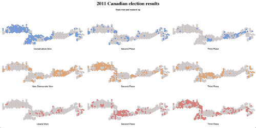
Built a cartogram visualisation for Canada and used the small multiples technic to look at where the main political parties finished first, second or third in the last elections. Inspired by Chris Campbell (@digitalcampbell), borrowed some code from Christopher Möller (@chrtze).
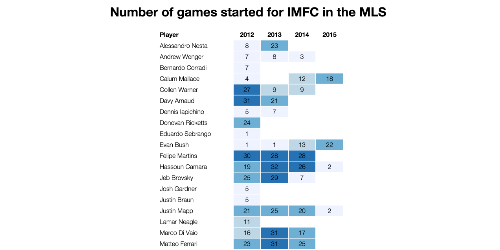
Table with the number of league match started for the Montreal Impact in the MLS. Borrowed some d3 from Gregor Aisch (github.com/gka) and added a dynamic colour_scale. The original idea is from Constantinos Chappas (@cchappas). The original exemple on bl.ocks.org can be found here.
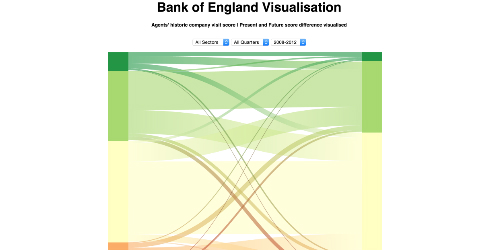
This is a sankey visualisation of 15 713 company visits, including present and future scores for eleven different economic indicators. With present scores on the left and future ones on the right, to show the respondants perception of the market. It was built with Nicolas Mezeret (github.com/nmezeret) as part of a data visualisation competition for the BoE.
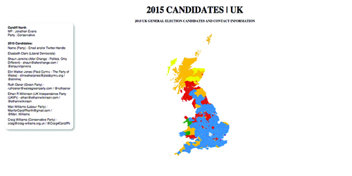
This maps displays the candidates for the UK's 2015 general election and their contact information in a tooltip box on mouseover. It is colored according to the color of the current MP of the constituency. A zoom scale and a click handler have been added to make navigation easier. It is also made using the d3.js library as part of the data visualisation module.
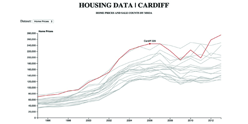
This multi-line visualisation compares home prices for different Cardiff MSOA (census area), from 1995 to 2013. It also includes a second dataset to compare the number of house sold in each MSOA. An invisible Voronoi tesselation is used to find the closest data point to highlight with mouseover. It was designed as part of a digital investigation module and is made with d3.js.
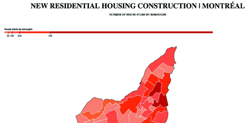
A visualisation of new residential development in Montréal. This is a choropleth map reading a csv to scale the boroughs' color according to the housing data provided. It also dynamically informs you of the name and number of new development in a borough when hovering over it. It was designed to test the d3 javascript library as complement to a data visualisation module.
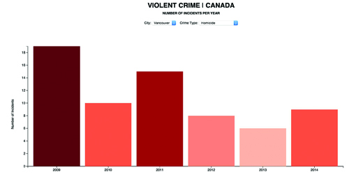
A visualisation of violent crime statistics in Canada major cities. This is an interactive bar chart visualisation working with two selection forms and scaling axis and color according to the selected data output. It was designed to test the d3 javascript library as part of a data visualisation module.
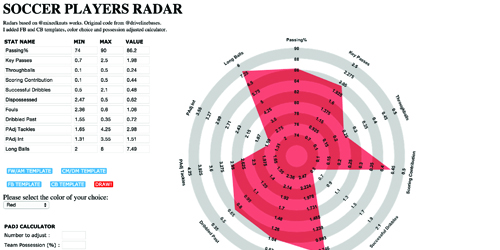
A sport's visualisation of soccer statistics. The radars were widely popularized by Ted Knuston (@mixednuts) during the 2014 World Cup. I modified the original code by @drivelinebases, adding the fullbacks and centerbacks template, the color menu and the possession adjusted calculator, which still needs some work. Made with Javascript and jQuery.

Interactive scroller highlighting the Golden State Warriors statistically amazing season. The scroller was built following Jim Vallandingham (@vlandham) scroller tutorial. It also makes use of Matthew Conlen (@mathisonian) D3moji.js. The data was last updated February 9, 2016.

Interactive Story going through the Canadian elections results. The narative presents seven visual elements detailing what happened on election night. It was designed on a 13-inch screen and is unfortunately not fully responsive as of now. The first slide will take some time to load. Influenced by the work of John Burn-Murdoch (@jburnmurdoch) and borrowed some of his code.

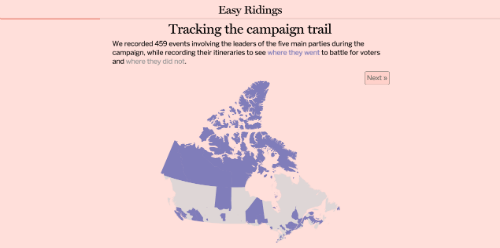
Interactive Story going through the Canadian elections campaign. The narative presents five visual elements detailing where the party leaders traveled during their campaign. It was designed on a 13-inch screen and is unfortunately not fully responsive as of now. The first slide will take some time to load. Influenced by the work of John Burn-Murdoch (@jburnmurdoch) and borrowed some of his code.

Built a cartogram visualisation for Canada and used the small multiples technic to look at where the main political parties finished first, second or third in the last elections. Inspired by Chris Campbell (@digitalcampbell), borrowed some code from Christopher Möller (@chrtze).

Table with the number of league match started for the Montreal Impact in the MLS. Borrowed some d3 from Gregor Aisch (github.com/gka) and added a dynamic colour_scale. The original idea is from Constantinos Chappas (@cchappas). The original exemple on bl.ocks.org can be found here.

This is a sankey visualisation of 15 713 company visits, including present and future scores for eleven different economic indicators. With present scores on the left and future ones on the right, to show the respondants perception of the market. It was built with Nicolas Mezeret (github.com/nmezeret) as part of a data visualisation competition for the BoE.

This maps displays the candidates for the UK's 2015 general election and their contact information in a tooltip box on mouseover. It is colored according to the color of the current MP of the constituency. A zoom scale and a click handler have been added to make navigation easier. It is also made using the d3.js library as part of the data visualisation module.

This multi-line visualisation compares home prices for different Cardiff MSOA (census area), from 1995 to 2013. It also includes a second dataset to compare the number of house sold in each MSOA. An invisible Voronoi tesselation is used to find the closest data point to highlight with mouseover. It was designed as part of a digital investigation module and is made with d3.js.

A visualisation of new residential development in Montréal. This is a choropleth map reading a csv to scale the boroughs' color according to the housing data provided. It also dynamically informs you of the name and number of new development in a borough when hovering over it. It was designed to test the d3 javascript library as complement to a data visualisation module.

A visualisation of violent crime statistics in Canada major cities. This is an interactive bar chart visualisation working with two selection forms and scaling axis and color according to the selected data output. It was designed to test the d3 javascript library as part of a data visualisation module.

A sport's visualisation of soccer statistics. The radars were widely popularized by Ted Knuston (@mixednuts) during the 2014 World Cup. I modified the original code by @drivelinebases, adding the fullbacks and centerbacks template, the color menu and the possession adjusted calculator, which still needs some work. Made with Javascript and jQuery.

HI, I’m Charles - an aspiring newsroom developer and data journalist, currently completing the MSc in Computational Journalism at Cardiff University. I’ve been learning data visualisation, information processing and digital journalism.
My curiosity for what is happening around me is only matched by my desire to share that information with others.
I’ve been interested in journalism from an early age – in the stories coming in from around the world. More recently I’ve started mastering new tools and ways of storytelling as you can see from my portfolio.
Anyone can make the news interactive, but I believe it can also be more relevant and meaningful through developments in digital journalism and the ability to write your own news apps.
I’m very enthusiastic about entering the industry at a time of great change and look forward to exploring the limits of the possible futures of journalism.
I’m a proud Montréalais – meaning I’m fluent in French and English. And, if you were wondering, I can rustle up a mean poutine.